Showing posts with label writing instrument. Show all posts

Saturday, May 5, 2012

Pelikan 20-pen-case review

A recent release from Pelikan, a 20 pen case seems to be a great addition to the range of leather products from this pen maker. Made from high quality leather, the pen case holds 10 pens on each side with a velvet divider, good for almost any size of pens. I've tested it in the shop with a MB149 and M1000 and they seems to be able to fit in snugly enough to avoid them from hitting each other during transport. Some may prefer to clip over the holders but I prefer to just fit in the barrel this way. After all it is tight enough to hold even a medium size pen (say M400).


The leather surface is beautifully crafted and seems very well made. 


Pelikan also does writing instruments and accessories for Porsche Design, there was an exact same cutting with that premium brand name with a premium price and metal zip components. Personally, I feel that the Pelikan logo here is a bit more classy and hold true to the manufacturer.


Tuesday, February 28, 2012

Montblanc Writers Edition 2011, Carlo Collodi Review


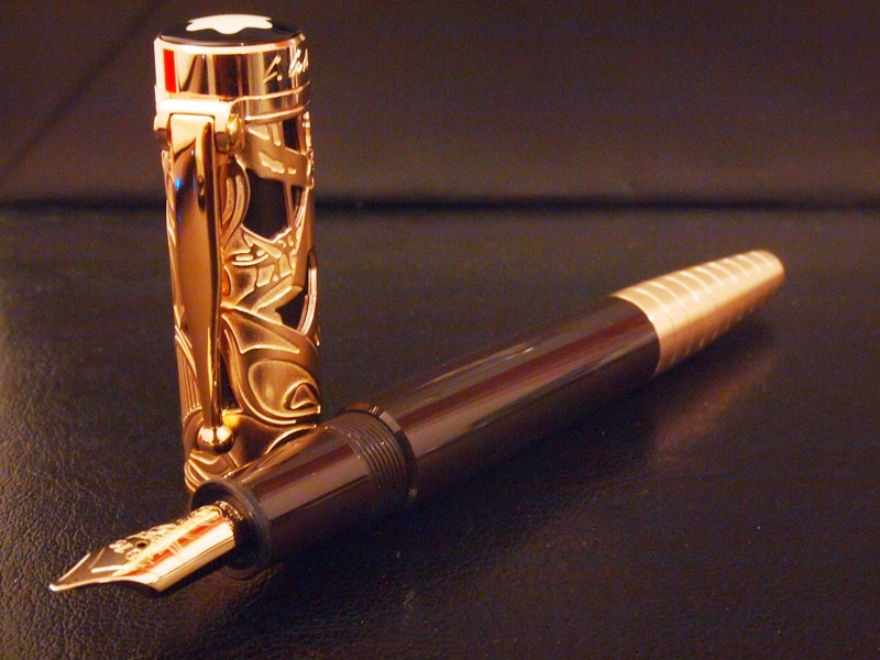
Before the Montblanc Collodi was released, I was excited to see this in the webpage and some leak photos. Subsequently I've concluded that this pen has too much gold, too ornate and probably impractical for everyday use. At that point, I’ve actually strike it off from my potential list of collection of pens. Soon afterwards, I’ve started to grow into it and it took several viewing of this pen to change my mind and soon realized that this is a well-made and beautiful pen after all. The first batch of the fountain pen was moving rather quickly and I’ve decided to wait and see. It is an attractive pen but it wasn’t enough for me to purchase it at the full price at a boutique, just to send it off for a nib exchange for a couple of weeks. I was hoping to wait till the supply trickle down to some authorized dealers and hope to find one with a bargain. Indeed that happened when I stepped into a shop and was actually hoping to find something else but instead the Collodi caught my attention. Furthermore, it has a B nib and the dealer was willing to give a fair discount (despite being a new stock) and allowed me to test dip! What more could one ask for.


First Impression:

It comes in a typical WE packaging style in a form of a book-like box. I’m beginning to like book-boxes of WEs. I’ve actually arranged the collection of my in my bookshelf and should this collection continues to expand further, I will have myself a row of WE (this is how I keep the pens now) Not too big, not too small. Also, it comes with an instruction booklet/warrantee card, complete with a brief description of the product, profile of the writer and visuals of the author and the collection of FP, RB, BP and pencils.


Design 8.5/10:

The MB Collodi WE is a very well ornate pen, make no mistake there. The skeletonized motifs have literal interpretations of the characters in Pinocchio’s story while the cone-like piston knob symbolizes Pinocchio’s nose. The skeletonized cap is over a resin barrel with a hinged-like clip completes the design along with the aged resin Montblanc star. The barrel of the pen is made of the same plain brown coloured resin, and unlike the precious black resin on the Miesterstuck series, this resin is very much opaque and does not have any kind of red luminance when near a light source. There are no ink windows. The nib, a single coloured champagne-gold plated over an 18k nib has a motif of a cricket. The piston knob is part of the 10 segments gold plated end tip of the pen. The piston knob breaks away at the 4th segment from the resin barrel as it turns away to activate the piston. The surface of the gold plating here has brushed surfaces that give a pleasant variety of gold texture on the pen. Though the cap seems to be shorter in proportion compared to other pens, the whole composition of all the components goes well together. The plain and simple looking barrel and the piston-knob balances out the ornate looking cap.


Construction and Quality 8/10:

A very well built pen. All joints and parts are solidly put together and precise. The golden skeletal cap over the brown resin were perfectly assembled and there are no loose joints or gaps there. The barrel screws in tightly into the cap and the piston knob when closed, looks seamless with the rest of the segment. However, one of my earlier viewing and handling of this pen at a boutique reveals that not all specimens are as well assembled (uneven gold plating and surface blemish). I suppose there is always a bad egg amongst the finest of products.


Weight and Dimension 7.5/10

When uncapped and un-posted, this barrel of the pen seems to be longer ones when compared to the other 146 size MB models. The longer dimension suggests that it is best to write with un-posted. The extra length of the piston knob which makes it rather comfortable to write with (my hands are almost of medium size). The pen is light and great for long writing sessions and it's almost as comfortable as the MB146. The extra length of the piston knob allows the pen to rest well on the back of my hand. Posting the cap will just make writing unbalanced with the heavy cap. Again, the brass component add a little bit of weight to the rear but still maintains balance on the overall handling of the pen (without the the cap, that is). The slight step down where the threads are does not seem to get in the way of my grip but rather help to secure the pen even more.


Refill System 9/10

The piston refill system is easy and smooth. So far, the smoothest piston mechanism I have ever used is the Pelikan M1000 or M800. The Collodi rivals those legendary pens. Unfortunately I do not have a picture to illustrate how the piston knob breaks away from the barrel when the piston is activated. I noticed that this is the first time in a modern MB that the treads can’t be seen when the piston is activated, again similar to the Pelikan construction. The turning of the knob is almost effortless and cleaning it with repetitive action has never been easier. the extra length of the knob also allows better grip for the turning action. The brushed golden plated surface gives a good feel of touch, somewhat warmer than the standard polished metal surface in other WEs. Having no ink window is not really a concern as this certainly will serve as my desk pen.


Nib and Performance 8.5/10

The B-nib is glass smooth and has a consistent and wet flow. Testing it at the shop helped me greatly in my decision to purchase this pen. Though I would still rate my 149 B nib as one of my favourite broad nibs, the Collodi does give the similar satisfaction with its stubbish lines and steady ink flow. The design of the nib has a cricket motif engraving. It is one of the simpler motifs in MB nibs, similar in spirit of Mark Twain or Kafka. The champagne gold plating gives it a uniform quality of appearance with the other parts of the pen.


Value 7/10

I resisted purchasing this during its release as I wasn’t certain with my decision to include the Collodi in my collection. I was hoping to find this with an AD to enjoy some discounted price, which I eventually did (>10% off, cheaper than the current ebay/online prices). The boutique retail price of this piece is a tab bit higher than the previous releases. For a new stock pen and readily available worldwide chain boutique and service, and the nib size of my choice without the wait, I think I’m rather happy with the deal.


Summary 8.1/10

The opulent impression of the pen may deter one from considering it as an everyday pen. However, the simple barrel and writing block, lightweight construction seems to suggest that this pen is made to be a workhorse, yet in the same time, the dimension and handling of the pen, seems to suggest that it is made to be a desk pen. The Collodi reminds me of other similar pens in the WE collection namely the WE Charles Dickens with a Sterling Silver cap with a simple solid colour resin barrel, and WE Schiller with an amber cap and again a simple resin barrel. Overall, I think the WE Collodi is one of the more interesting LE Montblanc, and worth taking a look at. It took several viewings and testing before I was convinced, and in my experience, things that takes a while to grow into tends to have a longer relationship compared to those that impresses at first encounter. Even though I’m not convinced yet that this will be in my regular rotation of pens, but it is certainly a worthy addition to my collection. The design and attention to details that has been put into the pen has all the qualities that can be easily appreciated.


Comparison with 146 and Mark Twain, the Collodi is significantly longer with the elongated piston knob


Comparison with 146 and Mark Twain, the Collodi has a smaller cap proportion to the overall length


Thanks for reading!

Friday, February 10, 2012

Comparison - Montblanc 146 with Sailor Realo 1911


Here I would like to share a comparison of these two fantastic writer, the MB 146 and Sailor Realo 1911. Both has very similar characters, sizes and specifications, as well as colors in production. MB 146 as many of you may know is a reliable and great writer that has proven itself over the years to be many's favourite writing instrument, overshadowed only by its larger sibling, the 149. The Sailor Realo 1911 is a newer production from Sailor and is one of the many few Japanese FPs that has intergrated filling system in the market. The piston filling is a newer addition to the 1911 line of FPs.


Looks and Appearance:

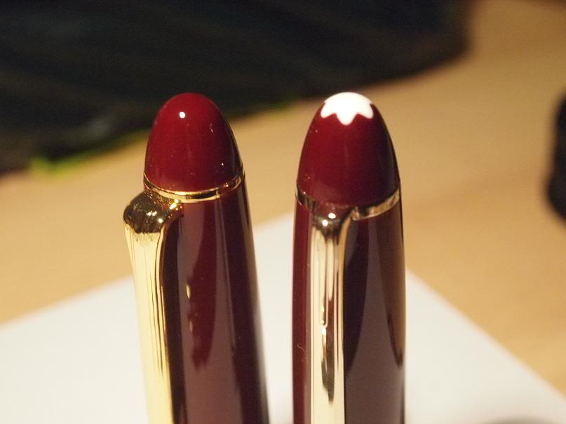
Here are some pictures that can speak for themselves. Both are very similar in shape and can be mistaken from afar. The Sailor however has a larger and clearer ink window while strip windows are used for the 146 allows a better material continuity look throughout the barrel. The MB star is probably the most apparent differentiator here in terms of appearance while the Sailor has larger gold plated rings compared to the MB. The gold plating on the Sailor seems to be more 'yellow' compared to the pale looking yellow gold of the MB. Sailor at the moment do not have rhodium plated rings and clip while MB 146 does that have option. MB however has ceased its production of the Bordeux resin version. Both pens looks very pleasing to the eye, not too loud and understated enough to be used as an everyday pen.


Weight and Construction:

MB 146 and Sailor 1911 are both made from 'Precious Resin' and PMMA Resin respectively. Are they the same thing? I am not qualified to say yes or otherwise but a lot of opinion seems to lean towards yes. The surface is smooth and shiny and both pens are very well put together and made to last. There are no loose joints, rings and clips are well assembled and both are first class quality. The clips on MB is a solid piece of metal while the Sailor is a folded metal to shape. The larger window in the Sailor 1911 seems to indicate that the thickness of the Resin is greater than the 146. Perhaps this could be a reason why the capacity is lower? I can't quite be sure unless I've dissambled it but from the exterior it does look that way. The modern production of the 146 does has the 'loose cap' syndrome when the pen is capped, while the Sailor cap always closes tightly. Both pen are comfortable to write with, be it posted or unposted. Perhaps the Sailor would be better if posted given the slightly shorter dimension that may make a large difference. MB is slightly heavier with the brass components.


Nib and Performance:

Both writes well OOTB, both are smooth and you can't put them down easily. Japanese nibs are significantly finer than the western counterparts. I've chosen F and M for my Sailor 1911s and M and OB for my MB 146s. That way I'll have a good range of nibs for different sizes, and taking the best of both brands; superior finer nibs from the Sailors and smoother bolder nibs from the MBs. Though the Sailor has a 21k nib as compared to the 14k nib on the 146, both these brands writes like a modern rigid nib. The MB 146 nibs are glass smooth effortless writing. The Sailor nibs are also very smooth but has the perfect amount of feedback to give that writing pleasure, even more apparent with the F nib, given the nature of such width.


Refill System:

Both are piston fillers, one of my most important criteria. MB uses brass for its piston components while Sailor's is plastic. Both mechanism works the same way and both are smooth and easy to use. The MB however has a larger capacity (more than 1 cc, i can't remember the exact number) while the Sailor Realo has the capacity of 1 cc. The piston knob for the MB is larger, making it easier to handle while the Sailor's piston knob is smaller and probably will take a bit to get used to. Then again, if one find the Sailor comfortable to use, one shouldn't be able to have problems with the smaller knob size. Both has windows to indicate the ink level. While the MB has a strip windows that are more elegantly design and subtle, the Sailor emphasized its window and made it an apparent design feature to see the colours of the ink.


Value:

MB retails at about USD 600-700 while the Sailor Realo is approximately USD350. This may be a major factor especially in deciding the two, as they are both very similar in looks and characteristic and performs equally well. However, given the large second hand supply out there for a 146, there are many opportunity to own it at much less, if one is not keen on free nib exchange programs.


Summary:

Though both pens looks very similar, but they do have different handling characteristic. Each has its strength and not many weaknesses. Both are good examples of great engineering and manufacturing process to ensure the best in their product. The MB 146 has the flair and a good feel of a well designed pen, with the history behind it that exudes quality. The Sailor 1911 is a well tuned and high performance machine of a pen. I have been continually and pleasantly refreshed in my writing experience, changing from pen to the other, as they give a similar feel and physical experience, yet different characteristic when the nibs touches the paper.


Thanks for reading!


Sunday, January 1, 2012

Pelikan Demonstrator M1005 - Review

Shortly after obtaining my M1000 (black), I can’t seem to get enough of the excellent writing quality and experienced offered by this flagship model. The semi flexible nib, the built quality and the smoothness of the piston filler makes is up there along with many other great models such as MB149, and some would say even better. 


I knew that eventually I will be finding and excuse to obtain another of the same model. Perhaps with a different barrel design, nib size etc. Before I know it, I found myself back in the same shop, PenGallery and greeted by the same smiley salesperson who was ready to take out any pen for testing. I then noticed that the M1005 was available and was informed that the only available nib at the moment was F nib. I was already very much in loved with the F nib on my M1000 and surely would not mind another one (I’ve tried other sizes , EF, M and B and doesn’t quite agree with them, it’s a personal choice, really).


I’ve seen all the pictures available on the internet, and I can say it looks much better in flesh. I must say it is pleasantly delightful to experience the flagship pen as demonstrator, it feels like a totally different pen and yet has all the great characteristic of this fine writing instrument. In fact, in some view, it is an even better instrument. The nibs of the same size seems smoother, with silver trims (which I love) and the details are sharper, not to mention the wonder of seeing all the innards and observing how it works. Maybe it’s my imagination, but I was convinced to have this as my second 1000 series. 


(Note that this review is built on some of the similar points of my previous review of the M1000, just some adjustment to address to the demonstrator’s quality)


First Impression


The Pelikan M1005 comes in what would be regarded as a the new style of packaging Pelikan pens, but with a cut out clear window, in spirit of the demonstrator. It’s a simple and modest packaging and serves it purpose to give adequate protection to the writing instrument. Inside, the pen is strapped with a transparent plastic strip that secures it to the soft base. Sponges are added in to provide extra protection from lateral impact. Seems like a lot of effort to keep it in one piece. Let’s see if the instrument is equally well put together. 


Appearance and Design 8.5/10


First of all, let me start by saying I am not a fan of demonstrators. The impressive looks and feel of the M1005 is enough to change that. Well, there you go. 


Take an elegant, understated but relatively boring(IMO) and plain looking pen such as the M1000 and turn it into a demonstrator, instantly you have a rather impressive looking writing instrument. Believe me when I say it is several notches above the current M1000 model; by a lot!. It looks like an entirely different pen but very familiar and similar in feel. 


Pelikan nibs though are some of the better writing ones in the market but they are certainly not one of the better looking ones, at least in my opinion. However, a monotone nib of the M1005 looks so much better. After all, I am a fan of silver trims, rhodium or palladium plating. The clear acrylic and silver appearance-plating gives emphasis on its basic form, and provide the opportunity to appreciate the functionality as an aesthetic of its own.


Construction and Quality 9.0/10


One of the better built pens around. I can’t help but comparing it to the Montblanc 149 and I can agree to most opinion that the M1000 feels a bit more solid compared to the 149. The cap screws in tight in about 1 turn, quick and ready for action. The joints and details are simple and built to last. The whole pen feels tight and well constructed.


Weight and Dimension 8.0/10


I generally have no issues with light or heavy pens as I’m rather flexible in adjusting to different pen size and weight. With the brass parts and its sheer size, though heavier than most pens, I find it rather comfortable to write with. Weight distribution is a little bit towards the piston knob due to the brass components, and for a pen this size, generally it will be more comfortable without the cap being posted on. It is a rather large pen and may not sit well on a shirt pocket due to the weight and size. I would normally keep my pens in cases so, that’s not really an issue for me.


Nib Performance 9.0/10 (Fine)


Unlike the standard M1000, where I’ve experienced a lot of problems while testing, the nibs of the M1005 seems perfect OOTB, at least the ones that I have tested. Perhaps the production line for this special edition has extra attention in quality control. This is where it brings the score higher than the standard M1000 production nibs with its higher reliability. As far as performance goes it is one of the best I’ve used so far


I have not much experience with flexible nibs and I’ve learnt that this may not be a true flex after all, but to have a nib that can yield to some pressure does gives a whole new writing experience. Without much pressure, it writes just like any other modern stiff nibs but a little pressure applied on it gives it nice variation and add interest to my writing. It does have a little feedback which is what I’m looking for and does not glide too effortlessly, like my other F nib on the 149. 


Filing System and Mechanism 8.0/10


The piston filling mechanism is smooth but not as smooth as the standard Pelikan. There’s some minor squeaking noise when turning the piston knob, as if scrubbing on clean clear glass. Nonetheless, the mechanism still functions well and it’s great to see reservoir of the pen being filled up. Cleaning is easy and particularly for a demonstrator, it is crucial to have the writing block removable to clean out all the parts thoroughly.


Cost and Value 7.5/10


There is a premium over the standard M1000 as this is a special edition after all. The M1005 is still at a very good value with a 3 years of warrantee and 4 weeks of nib exchange program. Pelikan service seems to have a good reputation, so there’s some reassurance there of after sales service. 


I was really contemplating over the price tag as it almost double the price of a regular M1000, for aesthetics. Then again, when compared to other brands and range, the M1000 is one of the best value flagship pens around to begin with. Adding a little more to something that gives value and delight seems to worth the extra cost in my opinion. 


Conclusion 8.33/10


In summary when compared to the standard M1000, it is better in almost every aspects in terms of looks and appearance as well as nib quality but somehow it does not have a piston smoothness as the regular M1000. Not to mention the higher price tag on something that has the same functionality as the regular ones may be a deterrent. It may be contributed by the additional manufacturing process that translates into the production cost (but then again Sailor managed to keep their demonstrator and regular pens the same price, hmm). Nonetheless, this is a one time release from Pelikan that should not be overlooked and certainly noteworthy to be in any serious pen collection.


Thank you again for reading, oh and Happy New Year 2012!