Before the Montblanc Collodi was released, I was excited to see this in the webpage and some leak photos. Subsequently I've concluded that this pen has too much gold, too ornate and probably impractical for everyday use. At that point, I’ve actually strike it off from my potential list of collection of pens. Soon afterwards, I’ve started to grow into it and it took several viewing of this pen to change my mind and soon realized that this is a well-made and beautiful pen after all. The first batch of the fountain pen was moving rather quickly and I’ve decided to wait and see. It is an attractive pen but it wasn’t enough for me to purchase it at the full price at a boutique, just to send it off for a nib exchange for a couple of weeks. I was hoping to wait till the supply trickle down to some authorized dealers and hope to find one with a bargain. Indeed that happened when I stepped into a shop and was actually hoping to find something else but instead the Collodi caught my attention. Furthermore, it has a B nib and the dealer was willing to give a fair discount (despite being a new stock) and allowed me to test dip! What more could one ask for.
First Impression:
It comes in a typical WE packaging style in a form of a book-like box. I’m beginning to like book-boxes of WEs. I’ve actually arranged the collection of my in my bookshelf and should this collection continues to expand further, I will have myself a row of WE (this is how I keep the pens now) Not too big, not too small. Also, it comes with an instruction booklet/warrantee card, complete with a brief description of the product, profile of the writer and visuals of the author and the collection of FP, RB, BP and pencils.


Design 8.5/10:
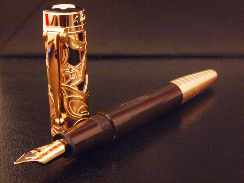
 The MB Collodi WE is a very well ornate pen, make no mistake there. The skeletonized motifs have literal interpretations of the characters in Pinocchio’s story while the cone-like piston knob symbolizes Pinocchio’s nose. The skeletonized cap is over a resin barrel with a hinged-like clip completes the design along with the aged resin Montblanc star. The barrel of the pen is made of the same plain brown coloured resin, and unlike the precious black resin on the Miesterstuck series, this resin is very much opaque and does not have any kind of red luminance when near a light source. There are no ink windows. The nib, a single coloured champagne-gold plated over an 18k nib has a motif of a cricket. The piston knob is part of the 10 segments gold plated end tip of the pen. The piston knob breaks away at the 4th segment from the resin barrel as it turns away to activate the piston. The surface of the gold plating here has brushed surfaces that give a pleasant variety of gold texture on the pen. Though the cap seems to be shorter in proportion compared to other pens, the whole composition of all the components goes well together. The plain and simple looking barrel and the piston-knob balances out the ornate looking cap.
Construction and Quality 8/10:
 A very well built pen. All joints and parts are solidly put together and precise. The golden skeletal cap over the brown resin were perfectly assembled and there are no loose joints or gaps there. The barrel screws in tightly into the cap and the piston knob when closed, looks seamless with the rest of the segment. However, one of my earlier viewing and handling of this pen at a boutique reveals that not all specimens are as well assembled (uneven gold plating and surface blemish). I suppose there is always a bad egg amongst the finest of products.
 Weight and Dimension 7.5/10
 When uncapped and un-posted, this barrel of the pen seems to be longer ones when compared to the other 146 size MB models. The longer dimension suggests that it is best to write with un-posted. The extra length of the piston knob which makes it rather comfortable to write with (my hands are almost of medium size). The pen is light and great for long writing sessions and it's almost as comfortable as the MB146. The extra length of the piston knob allows the pen to rest well on the back of my hand. Posting the cap will just make writing unbalanced with the heavy cap. Again, the brass component add a little bit of weight to the rear but still maintains balance on the overall handling of the pen (without the the cap, that is). The slight step down where the threads are does not seem to get in the way of my grip but rather help to secure the pen even more.
 Refill System 9/10
 The piston refill system is easy and smooth. So far, the smoothest piston mechanism I have ever used is the Pelikan M1000 or M800. The Collodi rivals those legendary pens. Unfortunately I do not have a picture to illustrate how the piston knob breaks away from the barrel when the piston is activated. I noticed that this is the first time in a modern MB that the treads can’t be seen when the piston is activated, again similar to the Pelikan construction. The turning of the knob is almost effortless and cleaning it with repetitive action has never been easier. the extra length of the knob also allows better grip for the turning action. The brushed golden plated surface gives a good feel of touch, somewhat warmer than the standard polished metal surface in other WEs. Having no ink window is not really a concern as this certainly will serve as my desk pen.
 Nib and Performance 8.5/10
 The B-nib is glass smooth and has a consistent and wet flow. Testing it at the shop helped me greatly in my decision to purchase this pen. Though I would still rate my 149 B nib as one of my favourite broad nibs, the Collodi does give the similar satisfaction with its stubbish lines and steady ink flow. The design of the nib has a cricket motif engraving. It is one of the simpler motifs in MB nibs, similar in spirit of Mark Twain or Kafka. The champagne gold plating gives it a uniform quality of appearance with the other parts of the pen.
 Value 7/10
 I resisted purchasing this during its release as I wasn’t certain with my decision to include the Collodi in my collection. I was hoping to find this with an AD to enjoy some discounted price, which I eventually did (>10% off, cheaper than the current ebay/online prices). The boutique retail price of this piece is a tab bit higher than the previous releases. For a new stock pen and readily available worldwide chain boutique and service, and the nib size of my choice without the wait, I think I’m rather happy with the deal.
Summary 8.1/10
The opulent impression of the pen may deter one from considering it as an everyday pen. However, the simple barrel and writing block, lightweight construction seems to suggest that this pen is made to be a workhorse, yet in the same time, the dimension and handling of the pen, seems to suggest that it is made to be a desk pen. The Collodi reminds me of other similar pens in the WE collection namely the WE Charles Dickens with a Sterling Silver cap with a simple solid colour resin barrel, and WE Schiller with an amber cap and again a simple resin barrel. Overall, I think the WE Collodi is one of the more interesting LE Montblanc, and worth taking a look at. It took several viewings and testing before I was convinced, and in my experience, things that takes a while to grow into tends to have a longer relationship compared to those that impresses at first encounter. Even though I’m not convinced yet that this will be in my regular rotation of pens, but it is certainly a worthy addition to my collection. The design and attention to details that has been put into the pen has all the qualities that can be easily appreciated.


Comparison with 146 and Mark Twain, the Collodi has a smaller cap proportion to the overall length
Thanks for reading!